
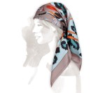
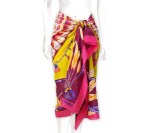
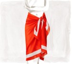
Just like Tiffany’s Blue and Burberry’s Plaid, Hermes is easily identifiable by their signature Orange. Possibly dubbed as the most classic and sophisticated brand in the luxury fashion industry: Hermes has time and time again provided their customers with a luxurious shopping experience and products of superb quality.
But how does this work online? Is it possible to replicate that deluxe in-store experience digitally? Yes, it is… and Hermes has done it! They have created a stunning, luscious digital experience, all while staying true to the brand.
I present to you the wonderful world of Hermes online…
![]()
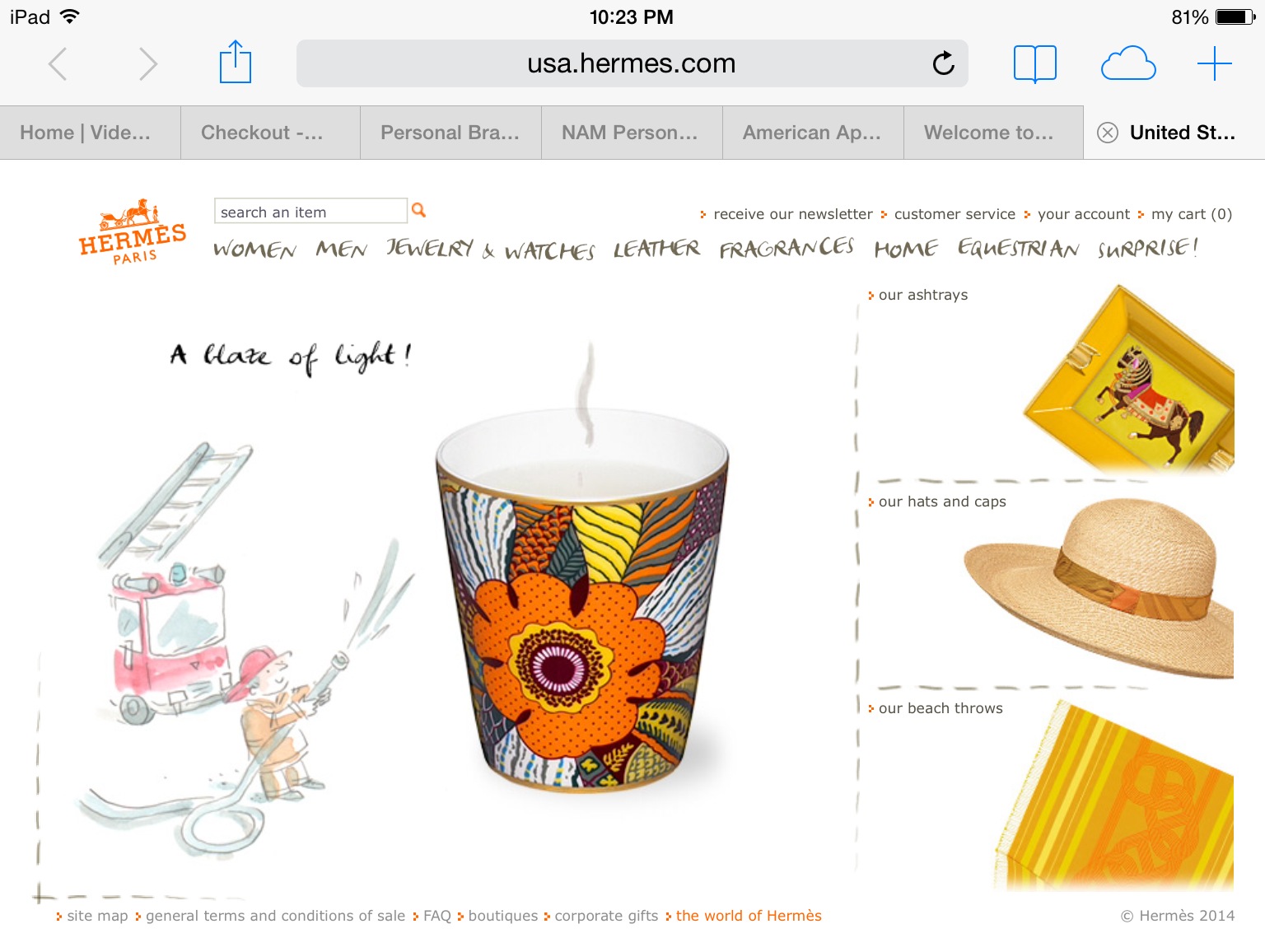
The site is simple and elegant, and yes you guessed it, there are hints of that signature Hermes Orange everywhere. The visual appearance emulates the qualities of Hermes: its chic, its subtle, its timeless. The user experience is neat. The functionality and organization of the site is clean, simple and not overwhelming. The online experience is pleasant, just like the experience of being in an actual Hermes retail store.
Like Hermes physical locations the website both visual and functionally is purposeful and well designed. Both the stores and website offers a narrow range of products compared to some other luxury retailers, which adds to the exclusivity factor of the brand.
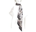
The visual design of the site is fluid. Beautiful custom animations are continued throughout every page with the products integrated into the illustrations – a very creatively formed ingredient. It simply oozes Hermes.


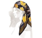

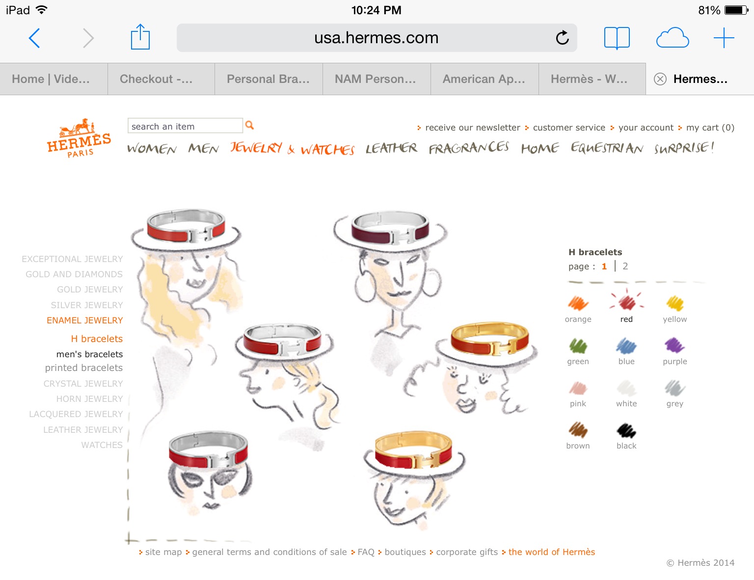
What’s so enjoyable for the user is that everything is incredibly visual. Even the selection of colors that products are available in aren’t listed as text, but instead are displayed as a palette of colors on the side.
The only issue I saw was the way that Hermes categorizes their products online – they categorize them in a way that is uniquely Hermes. Understandably so, but it potentially makes it more difficult for the user to find the exact product they are searching for. For example they have belts under “Women” instead of under “Leather Goods”. While this is certainly not illogical it could potentially take a user a second try to find it.
Consistent across desktop, mobile and tablet, Hermes has optimized its online property to adapt to multiple screens seamlessly. Also active on Instagram, which I must admit caught me by great surprise, since many luxury retailers have been slow to get on the Instagram wave. And for a brand that’s such “a classic” and old school I expected them to be one of the last to arrive. But my mistake… Hermes has certainly beat Chanel to the insta-phenomenon. Their Instagram account includes some 300 what posts, with Hermes quality content, photos and short videos presenting their new campaign “kiss the frog”, which is also highlighted on the homepage of their website, and of course they didn’t forget the use of their signature orange.
Every platform, screen or page that the user interacts with is consistent with the brand and with one another. It flows, it’s intuitive and it’s usable.
“A million small things done well with love and creativity to bring you closer to the brand.” I am sincerely fond of this brands website and of course everything orange and Hermes…
